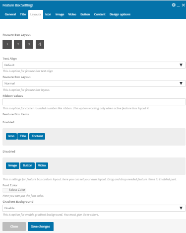
This is the setting for Feature Box Shortcode
- Feature Box – This shortcode was used to display Feature Box into various style.
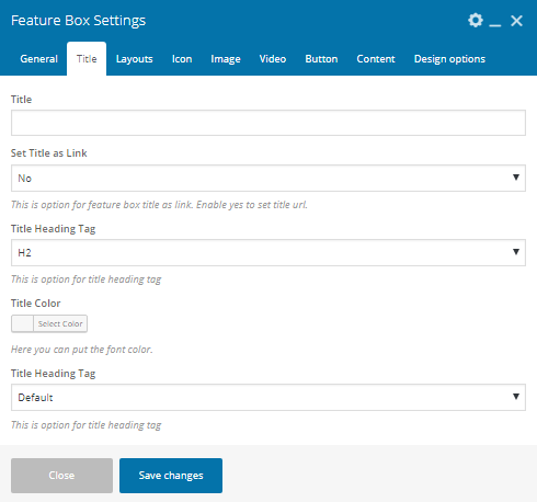
- Title – Enter The Section title here.
- Set The Title as a link – This is an option for feature box title as a link. Enable yes to set title URL.
- Title Heading Tag – Here you can Title tag(h1,h2,h3,h4,h5,h6).
- Title Color – Here You can Change Title color.
- Text Transform– You can change here text. transform(upper,lower,capitalize).
- Feature Box Layout– Here You can change the layout.
- Text Align– Here You can change the alignment.
- Feature Box Layout– Here You can change the layout.(Normal, grid).
- Ribbon Values – This is an option for a corner rounded number like a ribbon. This option working only when active feature box layout 4.
- Feature Box items – This is settings for feature box custom layout. here you can set your own layout. Drag and drop needed feature items to Enabled part.
- Font Color – You can change the text color.
- Gradient Background – This is an option for enable gradient background. You must give three colors.
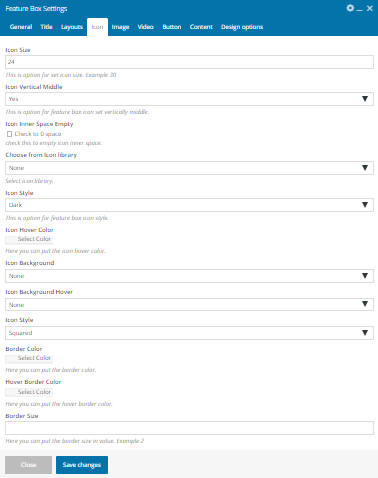
- Icon size– Here You can set the font size.
- Icon Verticle middle – This is an option for feature box icon set vertically middle.
- Icon Inner Space Empty – check this to empty icon inner space./li>
- Choose from Icon library – Select icon library.
- Icon Style – This is an option for icon style.
- Icon hover Color – You can change the icon hover color here.
- Icon Background – You can change the icon background color.
- Icon Background hover color – Here you can change the icon hover background color.
- Icon style – Here you can set icon style as ( Rounded, square, Circled).
- Border Color – Here you can choose icon border color.
- Border Hover Color – Here you can choose icon border hover color.
- Border Size – Here you can choose border width.
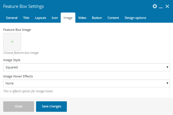
- Feature Box Image – Choose feature box image.
- Image Style – Here you can change the image style (Square, Rounded, Circled ).
- Image hover Effects – This is effects option for image hover.
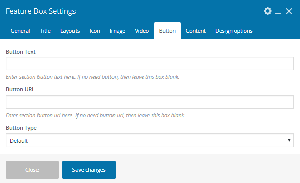
- Button Text – This is an option for pricing button text.
- Button URL– This is an option for pricing button URL.
- Button Type – This is an option to change button style.


