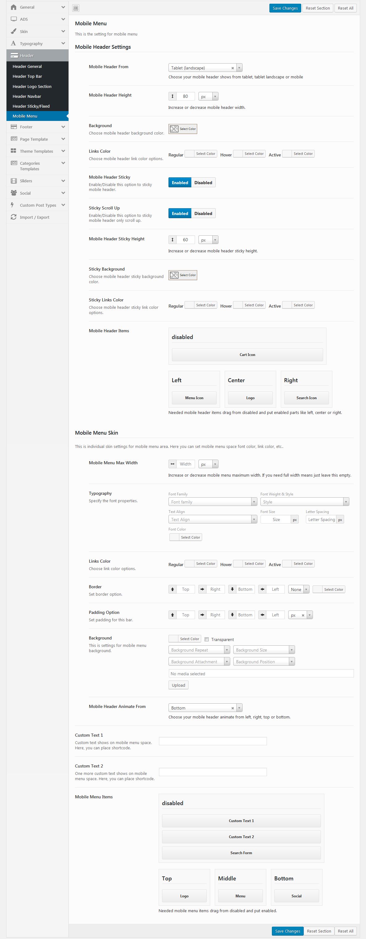
- Mobile Header Settings:
- Mobile Header From: Choose your mobile header shows from tablet, tablet landscape or mobile.
- Mobile Header Height: Choose increase or decrease mobile header width.
- Background: Choose your mobile header background color.
- Link Color: Choose mobile header link color options, like Regular, Hover, Active.
- Mobile Header Sticky: You can Enable/Disable sticky mobile header.
- Mobile Header Items: Needed mobile header items drag from disabled and put enabled parts like left, centre or right.
- Mobile Menu Skin: Choose your individual skin setting for mobile menu area. You can set for mobile menu space like typography, background color, link color options, border option, and padding option.
- Mobile Menu Max Width: Choose Increase or decrease mobile menu maximum width. If you need full width means just leave this empty.
- Mobile Header Animate From: Choose your mobile header animate from left, right, top or bottom.
- Custom Text 1 and 2: Enter your custom text to show on mobile menu space. (You can enter short codes).
- Mobile Menu Items: Needed mobile menu items drag from disabled and put enabled. Available mobile menu bar items are logo, search, social, secondary toggle, search toggle, phone number, address text, email and custom.


